Blog Post
Cool New Features of WordPress 3.6
 Things are a little hectic at MWD Web this week, so today’s post is a short one. We’re doggedly committed to posting every week, though, so by gum we’re going to post!
The team of developers behind WordPress released their latest version, 3.6, earlier this month. We’ve had a few weeks now to play around with the polished release version (as opposed to the beta versions), and we’re liking what we’re seeing.
While 3.6 was in development, the team listed one of the features as “an improved system for managing your menus.” We weren’t quite sure how they planned to improve it, since the drag-and-drop system they premiered in 3.0 was so simple and smooth. But, sure enough they’ve made it better!
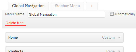
The biggest and best change (in our opinion) is the new way of listing all the menus you’ve created. You can create as many new menus as you like, and assign them to various positions in your theme or use them in a widget. That flexibility is great, but in the past your menus were listed as tabs along the top of the window. If you had a lot of menus, you ended up having to scroll through to find the one you wanted. (Never mind that the example image only has two)

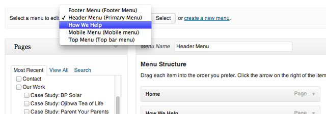
The new version, though, has a handy drop-down menu instead, and it shows you where in the theme each menu is assigned.

It’s a small thing, but it’s made the already-great menu system that much better.
Hopefully this little tip will help some of you WordPress site owners. Now, if you’ll excuse us… back to work!
