Blog Post
New Year, Slightly New Design
 Last week we took an introductory look at some of the problems that can pop up when you make drastic changes to your site overnight. This week, we’re focusing on a style of design process that can ease the transitions.
First a word about practicality. For all the talk last week about the problems inherent in completely revamping your design, it’s true that sometimes you just have to make some big changes. For example, if your site looks like it was built in 1998, it’s probably time for an overhaul.
For the purposes of this post, we’ll assume your site is relatively up to modern standards, ideally built on a content management platform of some kind. What it comes down to is this: once you’ve got a site that’s up to snuff, it’s wise to keep tinkering with the design in small ways, on a regular basis. The Web is changing all the time, and if your site is also changing regularly, you’ll find it evolves naturally and keeps current. Two years later it might look completely different, but it will have arrived there gradually. This eases the stress on you the site owner, and it also makes things more digestible for your visitors.
This approach to design is a natural complement to the principle of A/B testing: change things on a very small scale; see if the change helps or hurts your conversions; and keep the option that’s better. Wash, rinse, and repeat.
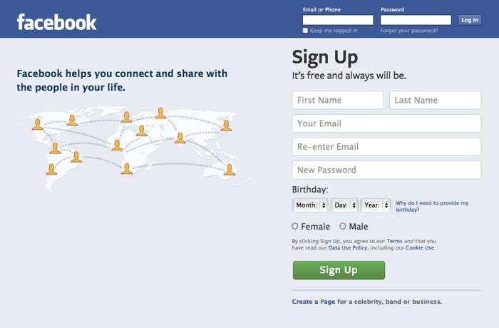
We made light last week of Facebook’s habit of big design changes, but in some cases they do make some sensible updates. Let’s look at the main login page, before and after some recent changes:

Before

After
It’s very clearly the same site, with all the same navigation and features. At the same time, there are some distinct differences (for example the size of the words “Sign Up” and the green button), but they don’t distract from the overall experience. The next redesign, if they follow this pattern, will look similar to the After shot, but less similar to the Before shot as they continue to evolve the design.
We encourage you to engage with your Web dev shop to implement this sort of iterative updating. When you look back two years later, you’ll be amazed at how smooth the process was, and yet how much has changed.
Image by Bryan Wright
